Funnel
Funnel Analytics help you understand which steps of your app might need improvement to increase conversions and revenue. By analyzing funnels, you can answer questions like:
How do your app conversions change over time? Are there any seasonal trends?
Monitor changes in conversion rates over different time periods to spot patterns or trends that might be influenced by seasons, events, or updates.
How do conversions change during marketing activities or new circumstances?
Track how conversions shift in response to specific marketing campaigns or other changes, helping you gauge their impact on user behavior.
How do different regions react to your app updates?
Analyze how user behavior and conversion rates differ by region to understand how various updates or features perform in different markets.
What types of products convert better over time?
See which products or product features generate higher conversion rates, helping you focus on offerings with the greatest impact on your revenue.
With a funnel chart, you can gain deeper insights into user behavior by setting filters and groups, allowing for targeted analysis. Funnels work with the data gathered through the SDK and store notifications, so no additional configuration is required on your part.
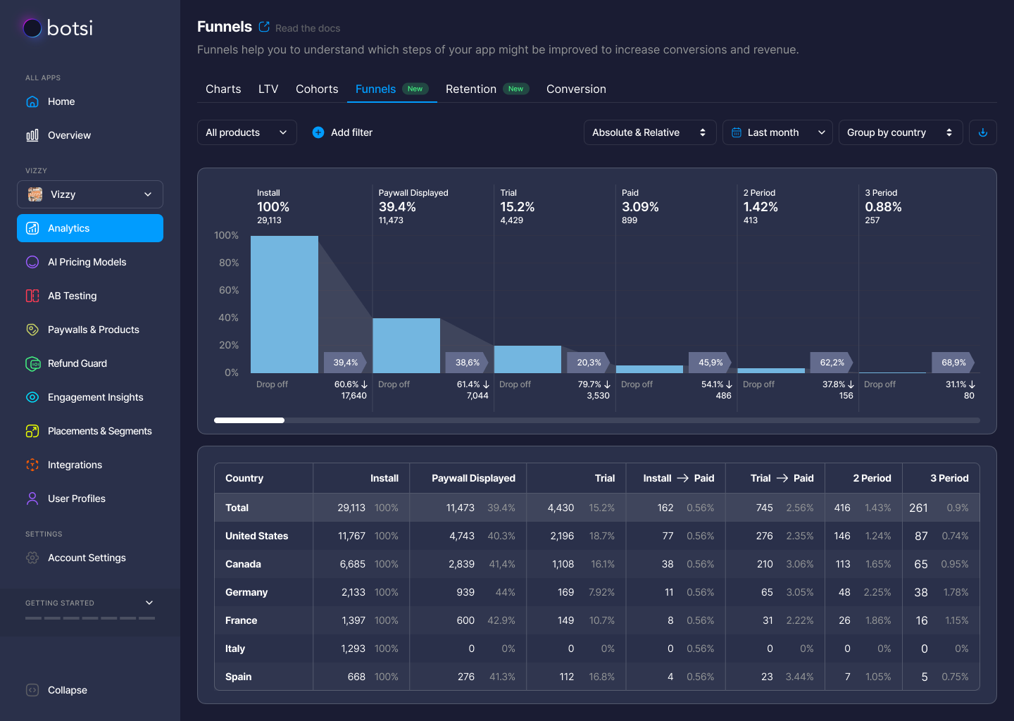
Funnel Chart Step-by-Step
Let’s break down the elements of a funnel to understand how to read the user journey on the chart.
-
The 1st Column (Install)
The first column shows the total number of installs, represented as an absolute value (not unique users) and also as 100%—the largest input number for relative calculations. If a user deletes and reinstalls the app, it will be counted as two separate installs.A grey area nearby shows the transition parameters between steps. The conversion percentage to the next step (e.g., Paywall Displayed) is shown on a flag, while the drop-off percentage and the absolute value of churn are displayed below.
-
The 2nd Column (Paywall Displayed)
This column shows the number of users who saw the paywall at least once. These are users who installed the app during the selected period. If a user saw a paywall in the period but installed the app outside of the selected time, their view won’t be counted.The percentage of paywall views is taken from the 1st step, which is the total installs. This percentage will be shown on the grey flag for that step. Data is collected from all your paywalls that use the
logShowPaywall()method.The conversion percentage to the next step (Trial) is shown on the flag, and the drop-off percentage and the churned customers are displayed below.
-
The 3rd Column (Trial)
This column shows the number of trials activated by users who installed the app within the selected period. If the product is non-trial, this column will be empty. It also shows the percentage of trials from the first step (installs) and the conversion from the previous step (paywall displayed).The grey area next to this column shows the conversion percentage to the next step (Paid), with drop-off percentage and churn shown below.
After the trial period, you can hover over the steps to see reasons for churn.
-
The 4th Column (Paid)
This column shows the number of activated subscriptions. For products without trials, it includes subscriptions from the paywall directly. For products with trials, it includes the number of trials that converted into paid subscriptions. If you have both types of products (with and without trials), this will be a sum of both.The conversion percentage from installs to paid is displayed at the top, with conversion to the next step (renewal to the 2nd period) on the grey flag. Drop-off percentage and churn data are shown below.
-
Subsequent Columns (Renewals)
After the 2nd renewal period, the steps continue with a similar structure for the 3rd, 4th periods, and so on. You can scroll horizontally to see data for many periods, provided there is enough data available.The same logic applies to these renewal periods:
- Percent from installs at the top.
- Percent from the previous step at the bottom.
- Absolute amount of renewal at the top.
- Churned users at the bottom.
- Hover for churn reasons pop-up.
Table View, Filters, and CSV Export
The funnel chart is complemented by a data table that provides numerical details for each step. Some amendments are made in the table for easier understanding:
- Columns display data for all steps except for the first paid subscription. Instead, separate columns are shown for Install → Paid and Trial → Paid, which highlight key conversion points when free users become paying subscribers.
You can also filter the data by:
- Product type (e.g., economy, length).
- Time range for analysis.
- Country segmentation.
- Traffic attribution.
- Store.
You can choose to view absolute values, relative percentages, or both depending on the data you need.
Finally, the CSV export option allows you to export funnel data to analyze it further in Excel, Google Sheets, or your own analytical system.