Use the Builder Elements
When creating a Paywall, you will customize its appearance and content using the Botsi Builder Elements. This guide walks you through the two main areas you will interact with:
-
Layout Settings
Use this section to build and structure your paywall by adding and configuring Builder Elements such as: -
Localization
Customize content for different languages and regions by adding locales and translating text or replacing images.
Use the device selector at the bottom of the screen to preview your changes on different devices.
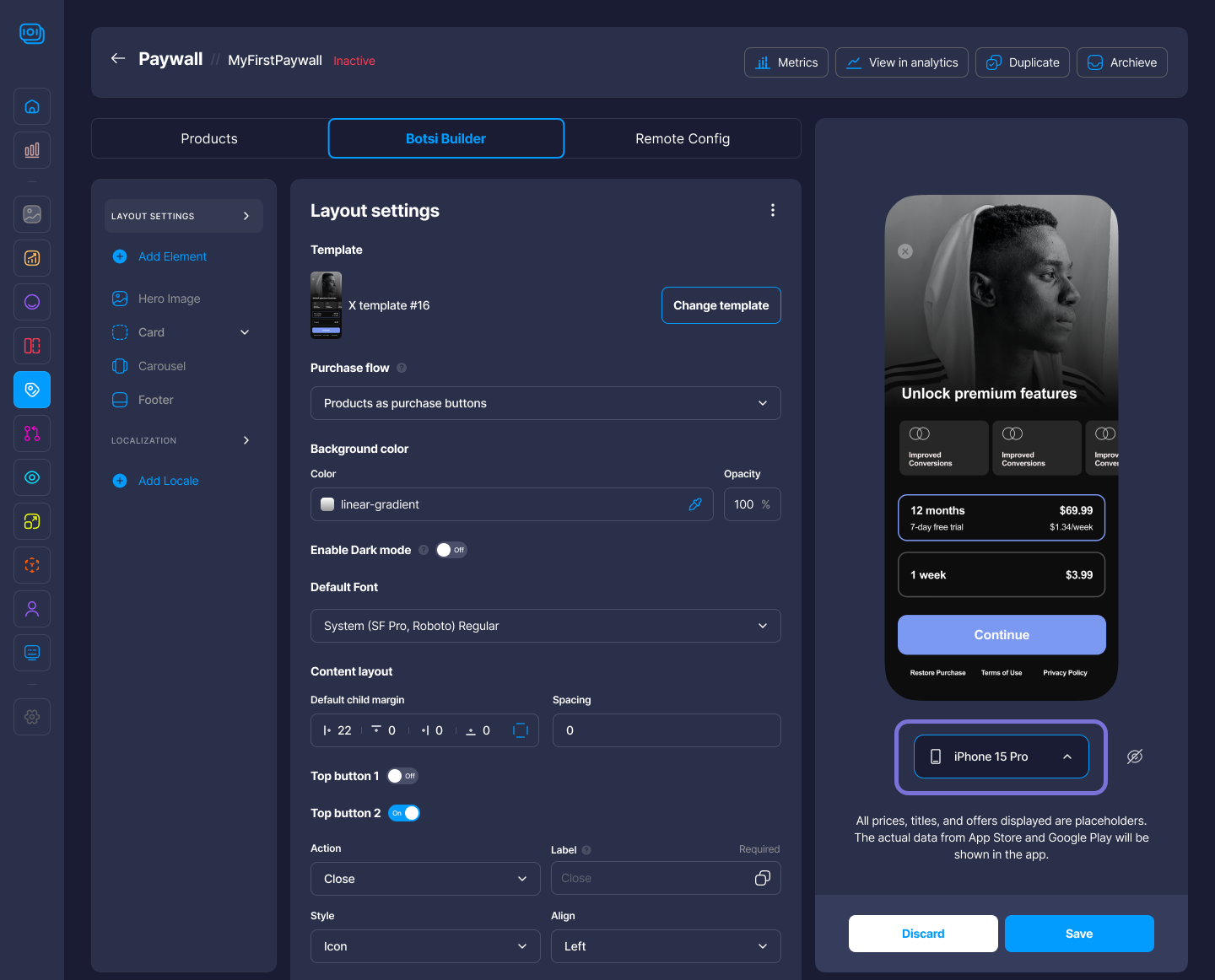
Layout Settings
The Layout Settings section lets you build the structure of your paywall by adding, removing, and arranging elements like images, text, cards, and buttons. Each element can be customized individually to match your design and content goals.
- Select the desired Template. Click Change Template to choose a different one.
- Select the Purchase flow type (e.g., Products as purchase buttons).
- Establish the background Color and its Opacity.
- Enable/disable Dark Mode.
- Select the Default Font.
- Configure the Default Child Margin for the Content Layout.
- Set overall Spacing between Layout elements.
- Enable/disable Top Button 1 and Top Button 2.
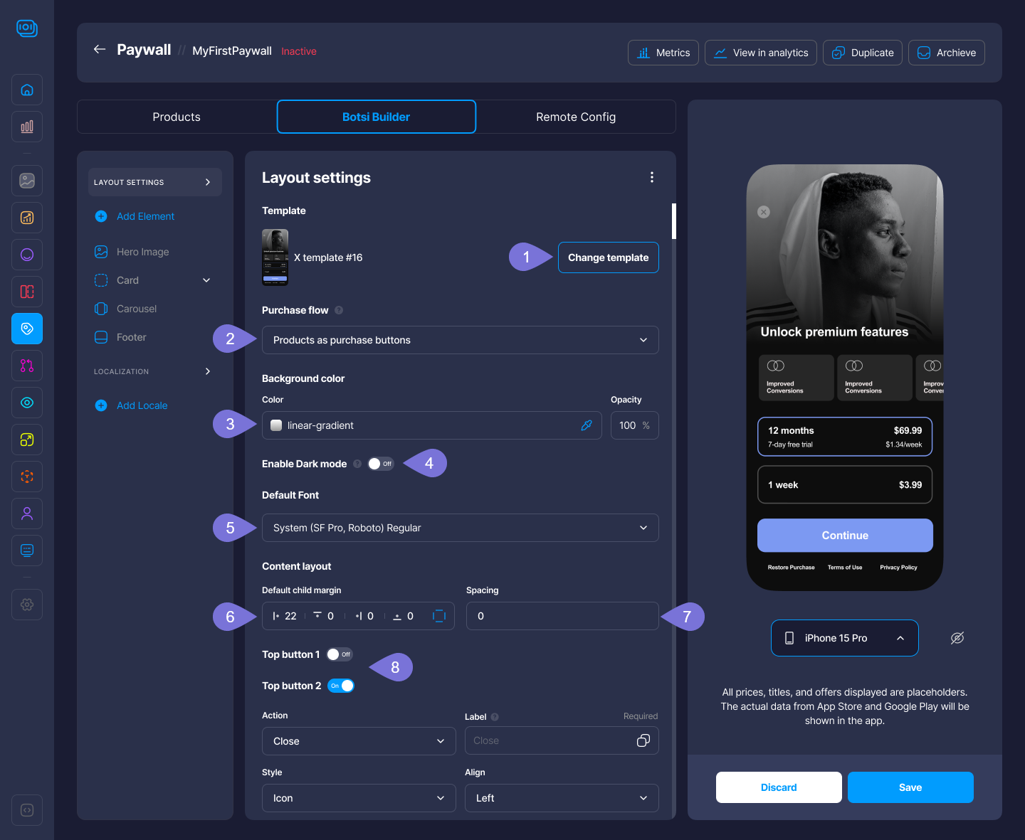
- Set the Action for the enabled Top Button (e.g., Close, Preview, or Next).
- Set the Label for the enabled Top Button.
- Select the Style of the enabled Top Button (e.g., Icon).
- Set the Alignment of the enabled Top Button (e.g., Left).
- Set the Show After Delay time (with slider in milliseconds).
- Define the Style:
- Fill Color and its Opacity
- Border Color and its Opacity
- Border Thickness
- Choose the Icon Type, its Color and Opacity.
In the following section, we will explore how to customize key elements of your paywall, including the Hero Image, Card, Carousel, and Footer, to create a cohesive and visually appealing design.
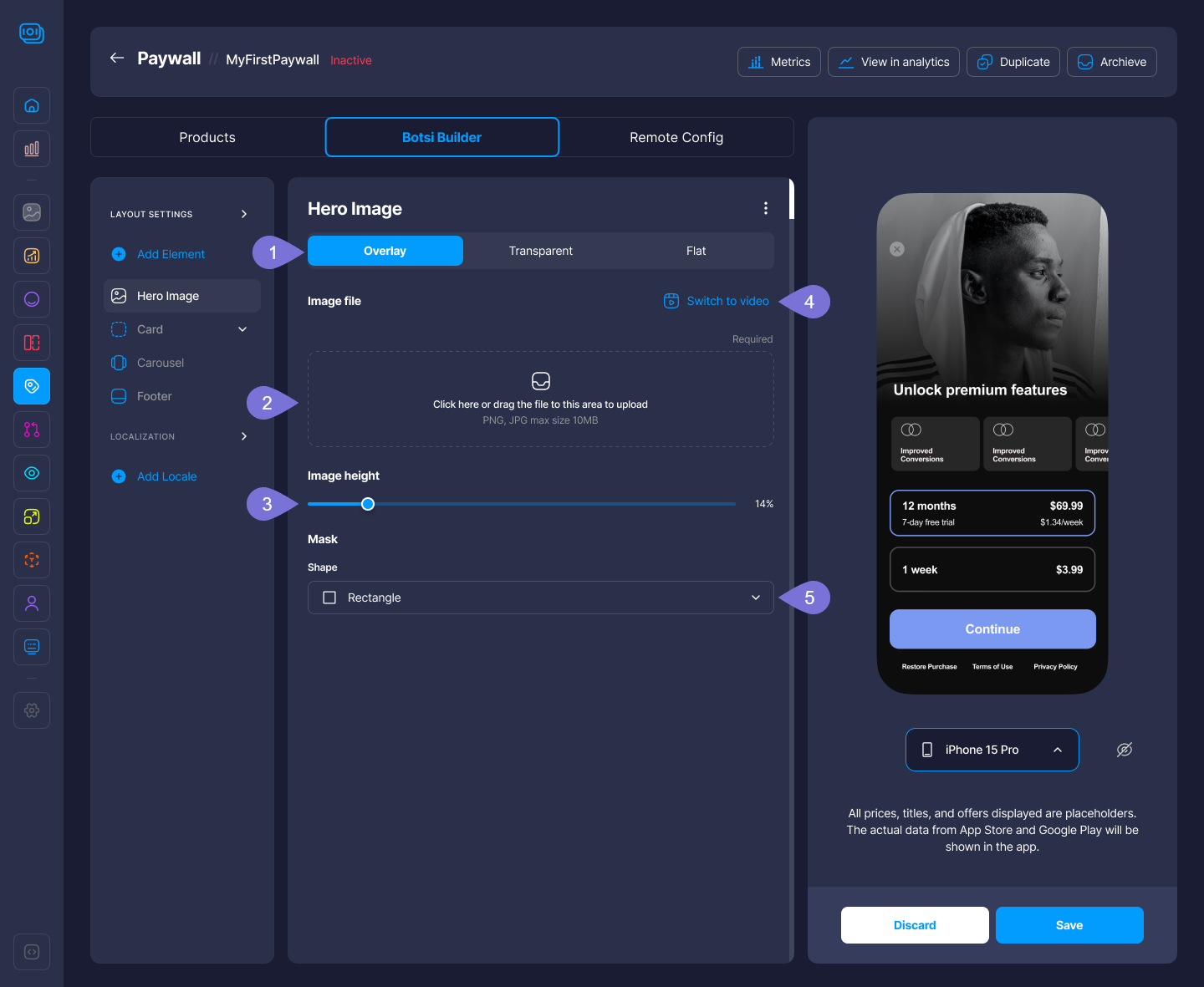
Hero Image
The Hero Image element allows you to place a visually impactful banner at the top of the paywall layout. It’s typically used to highlight branding, promotions, or product imagery. You can upload high-quality PNG or JPEG files (up to 2MB) and customize its size and positioning to grab the user's attention right away. You can manage three different modes:
- Overlay
- Transparent
- Flat
Overlay
A layout style where content appears layered over a background, often with some transparency.
- Select Overlay to activate this mode for the hero image.
- Click on the upload area or drag and drop an image file (PNG or JPG, max size 10MB) to upload or change a Hero Image.
- Adjust the Image Height using the slider to change how much vertical space the image takes up.
- Click the Switch to Video option to change the media type from image to video.
- Select a Mask Shape (eg., Rectangle, Rounded Rectangle, Convex Mask, Concave Mask).
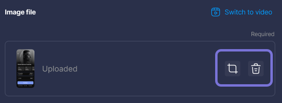
Once uploaded, you can crop or remove the image by clicking on the respective icons.
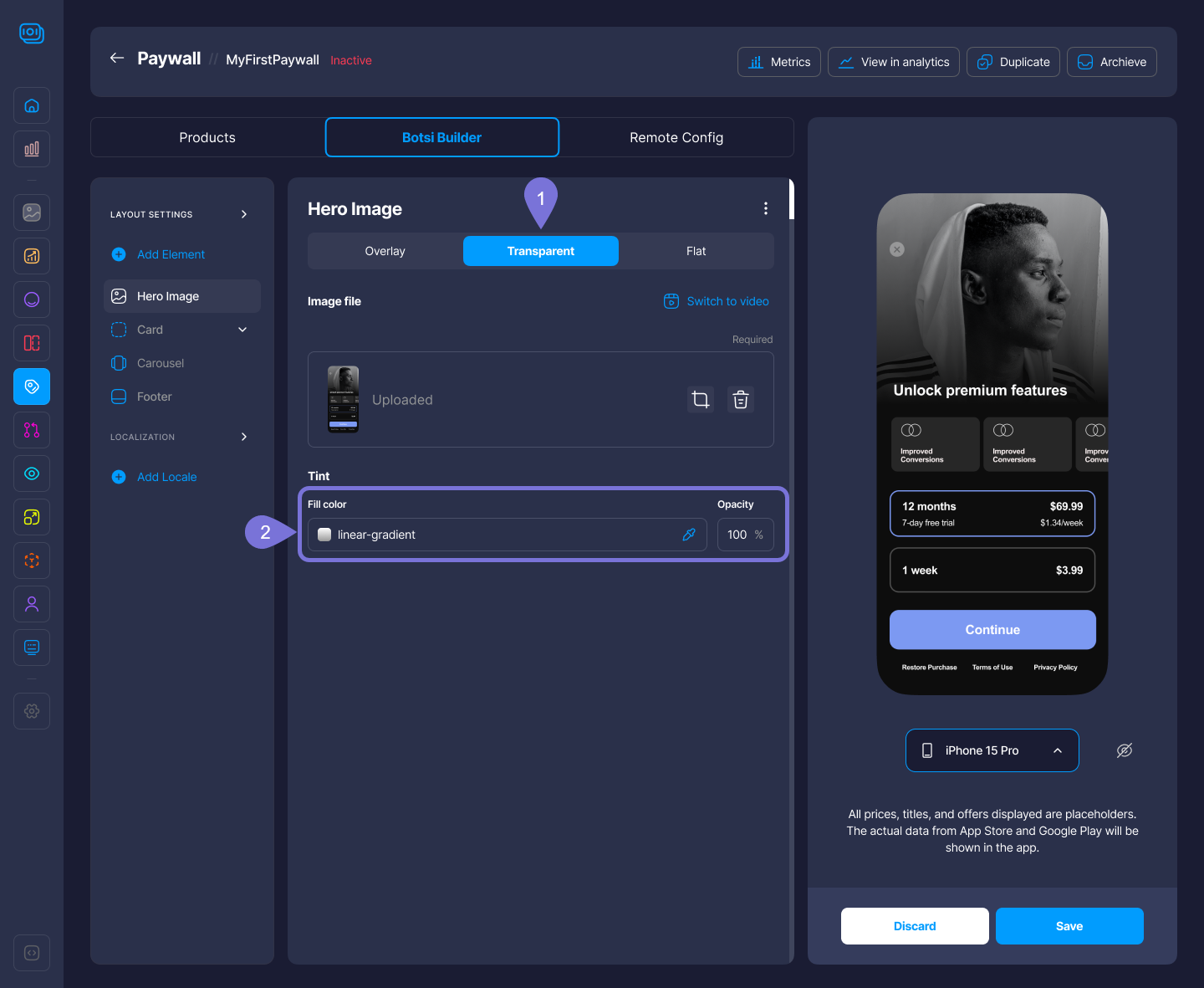
Transparent
A see-through layout with no background fill, letting the device or app background show through.
To upload or change an image, follow step 2 provided in the Overlay mode.
- Select Transparent to activate this mode for the hero image.
- Add a Tint (color overlay) by selecting the Fill Color and the Opacity.
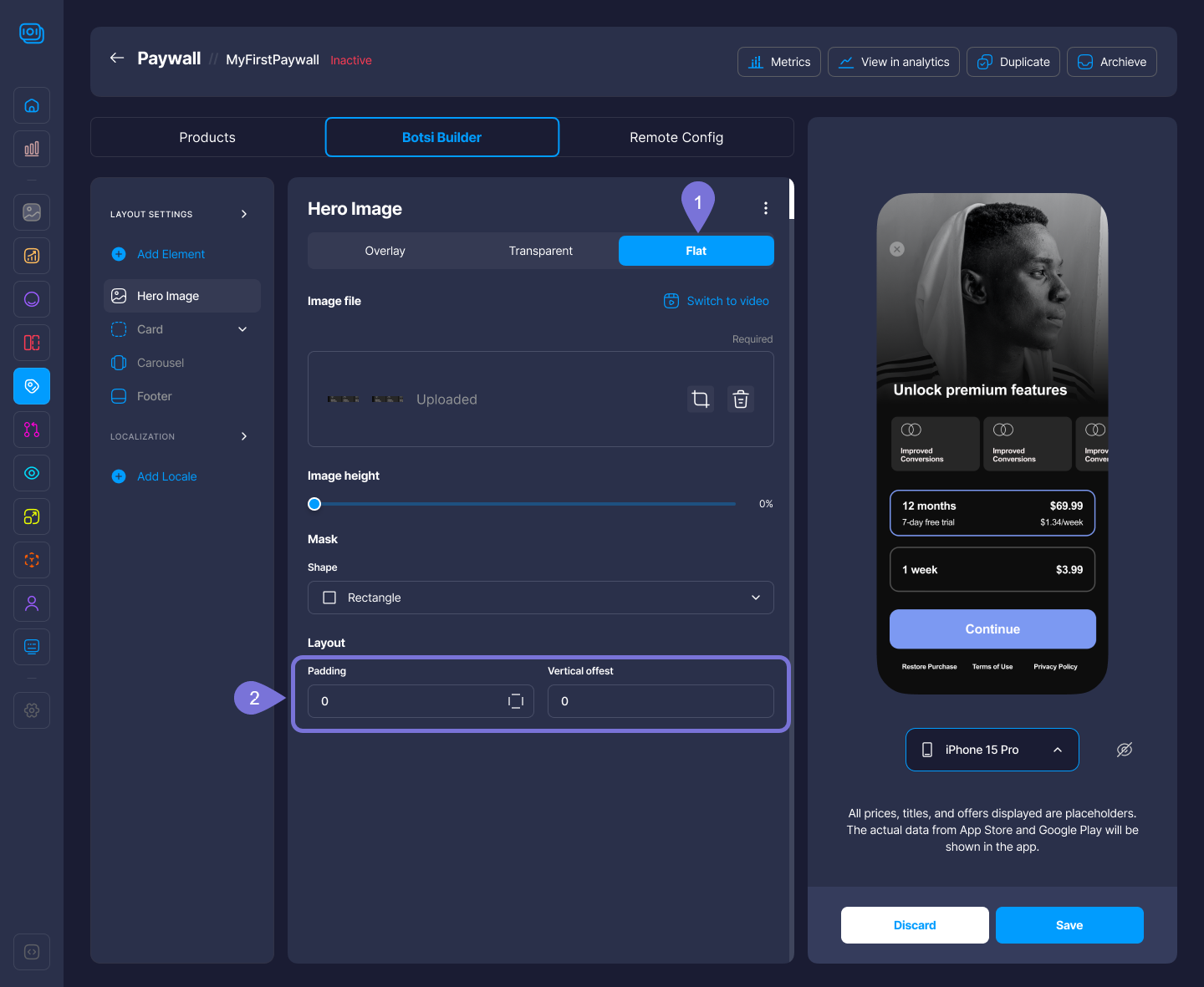
Flat
A minimal layout style with no shadows, gradients, or depth; it is clean and simple.
To upload or change an image; adjust image height; switch to video, and add a mask, follow steps 2 to 5 provided in the Overlay mode.
- Select Flat to activate this mode for the Hero Image.
- Customize the Padding and Vertical offset.
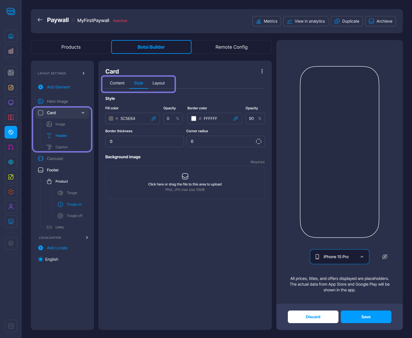
Card
The Card element functions as a container that can hold other components like text, buttons, or images. It’s useful for grouping related content with custom styling such as fill color, border radius, and opacity. Cards help visually organize the layout and guide the user’s focus. Within the Card Element, you can edit:
- Content: Card Items (e.g., Text, Images, etc.)
- Style: Fill Color, Opacity, Background Image, etc.
- Layout: Margins, Alignment, Padding.
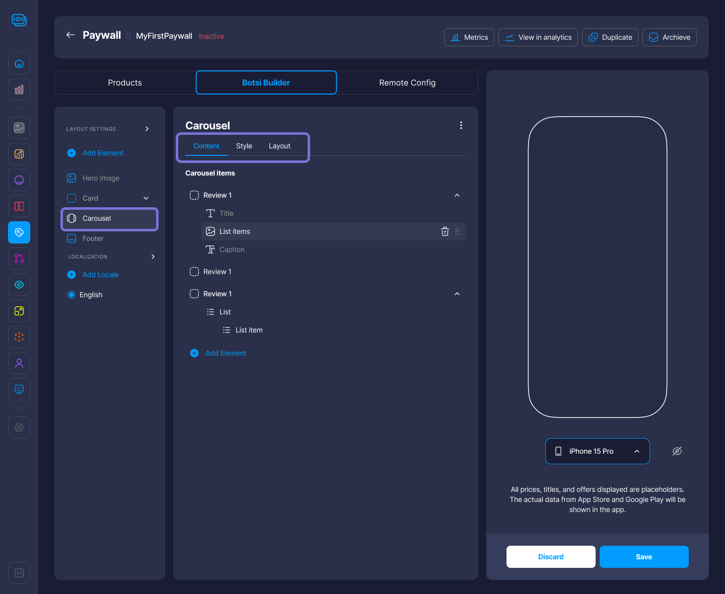
Carousel
The Carousel element lets you add a horizontal scrollable section with multiple images or content cards. It’s great for showcasing different features, subscription plans, or product variations in a compact, swipe-friendly format optimized for mobile screens. For this Component, you can edit:
- Content: Carousel Items (e.g., Text, Lists, Images, etc.)
- Style: Height, Color, Opacity, Background Image, etc.
- Layout: Padding.
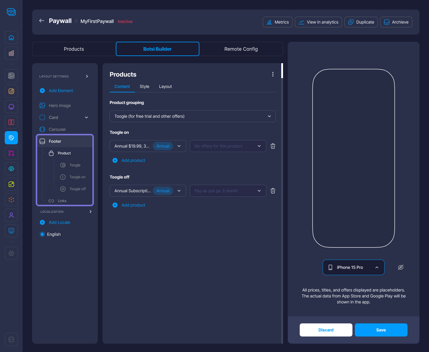
Footer
The Footer element is a static section that appears at the bottom of the layout. It's commonly used for legal text, links to terms and privacy policies, or localized content. You can customize its content and appearance by adding other Components (Text, Products, Links, etc.) to your Footer. You can edit:
- Content: By adding Product, Links, Text elements, etc.
- Style: This will vary depending on the Content. For example, for the link style, you can edit the Font, Size, Color and Dividers.
- Layout: Padding, Alignment, etc.
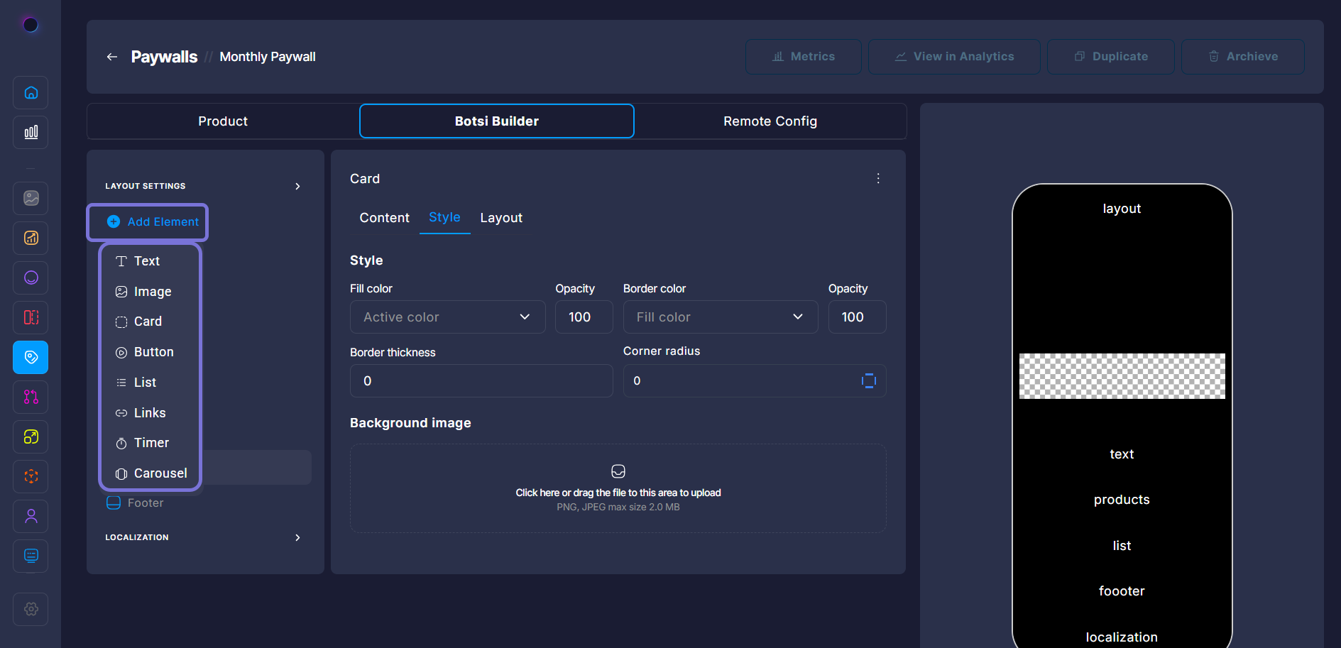
Click on Add Element in the left panel to insert new content components into the current layout of the paywall editor. You can add:
- Text: Add headings, paragraphs, or bullet points;
- Image: Insert static images for visual appeal;
- Card: Create content blocks with customizable options;
- Button: Add interactive buttons for user actions;
- List: Create ordered or unordered lists;
- Link: Add clickable links to external or internal pages;
- Timer: Include countdowns or timed events;
- Carousel: Add a rotating slideshow of images or content.
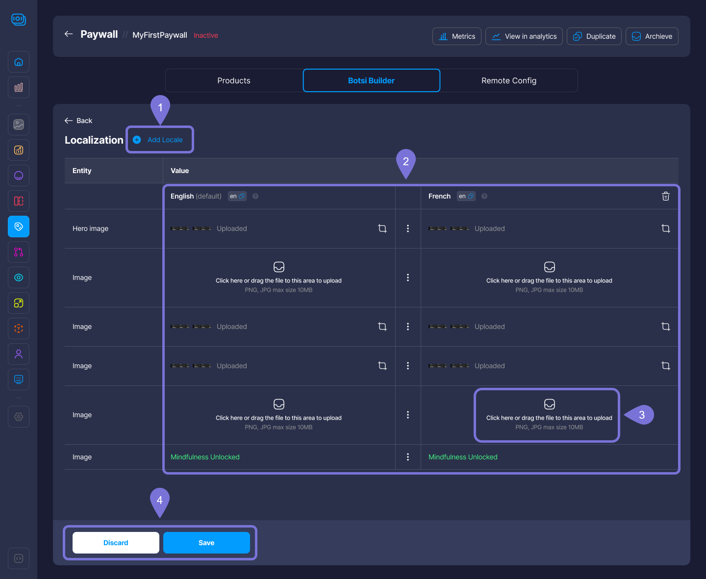
Localization
The Localization section lets you customize the paywall for different languages and regions by adding locales, which are combinations of language and country settings (e.g., en-US, fr-FR). This ensures users see content that is relevant to their language and region.
Edit Content in the Localization Panel
-
Add a Locale
- Click Add Locale at the top to introduce a new language/region combination (e.g., French, Spanish).
- Each added locale creates a new column where you can input translated or region-specific content.
-
Edit Text and Media Per Locale
- The left column shows the default content (e.g., English).
- The right column(s) reflect the added locales (e.g., French).
- For each entity (like Hero image, Image, or Text):
- Upload a localized image by clicking the upload area.
- Edit text directly in the cell (e.g.,
Mindfulness Unlocked). - Use the copy icon to duplicate content from the default locale.
-
Manage Localized Assets
- Images must be in PNG or JPG format, with a maximum size of 10MB.
- If no asset is uploaded for a locale, the app may default to the original version (e.g., English).
-
Save or Discard Changes
- Click Save to apply your updates.
- Click Discard to cancel and revert to the previous version.
This panel ensures each paywall version is localized for users in different regions, improving clarity and user experience.
Related Articles
For more information, consult the following pages: