Education / KidsHard paywallpaywall: post signup pre valuesocial proof heavythree tier comparisonannual default with trialfeature listtestimonial heavy
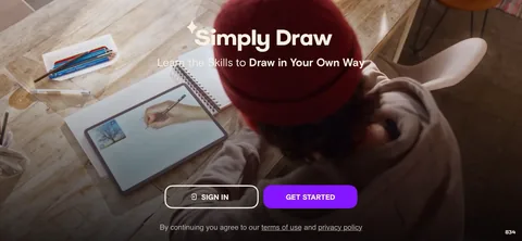
13The whole onboarding is a web view of the marketing site, not a native flow. Log In and Sign Up in the corner, a hero image, award medals, a testimonial. It reads like 2015 and it's still shipping, which usually means the funnel numbers hold up well enough that nobody's been allowed to touch it.4Email captured on its own screen, before the password, with the offer attached: 'Get Your First Month FREE'. Splitting signup in two means they bank the email even when someone abandons at the password step. That's a lead capture decision rather than a UX one, and for a subscription with a long consideration cycle it's the right trade.5'For Grown Ups. Please complete the equation to continue: 1 + 1.' A parent gate in front of the purchase flow. Kids app convention and an App Store expectation, cheap to build, and it stops a five year old tapping through to a charge.610'EASY CANCELLATION' set as its own heading on the account screen, explaining you can cancel through iTunes at any time. Objection handling placed exactly where the objection lives. The parent's hesitation on this screen is 'am I going to get stuck paying for this', and they answer it before it gets asked.13Annual $59.99 preselected, semi-annual $39.99 for six months, monthly with a free first week then $14.99. Semi-annual annualises to $79.98, which is more than the annual plan costs. The middle tier exists to make annual look correct, not to be bought.14'95% OFF MONTHLY PRICING' badges on the annual and semi-annual tiers. Annual at $59.99 against $14.99 a month is about 67% off, not 95%. A discount badge that doesn't survive arithmetic is a refund risk, and in a kids category aimed at parents it's a regulatory one too.17'More than 850 Lessons Across 10 Levels' with the Step-by-Step Learning Path drawn out from Kindergarten up. Parents buy curriculum coverage, not features. Showing the ladder their kid will climb is the right proof for this buyer.18Then several screens of curriculum detail: Reading, Math, The World Around Us, Science and Social Studies, Art and Colors. Long form selling aimed at a parent doing research. Most consumer apps would never ship this much copy, but the buyer here isn't the user, and a parent committing to a year reads the whole thing.242529'Thank You for Watching Our Video! New Members, See Our Special Offer.' Video first, then the offer. Straight direct response structure, the same shape as a long form landing page, which is exactly what this onboarding is.
 1
1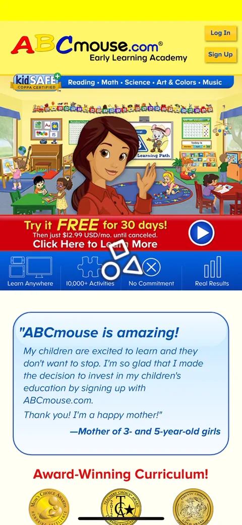 3
3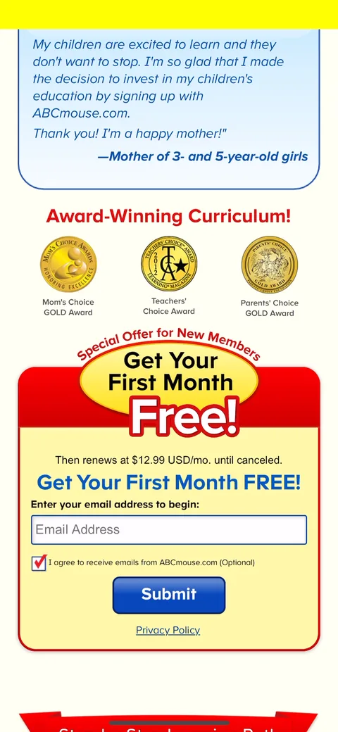 4
4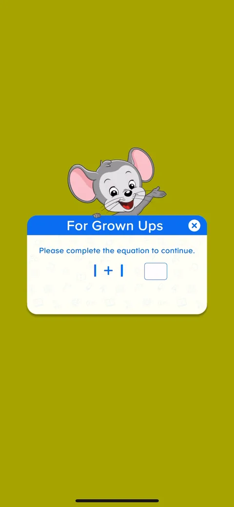 5
5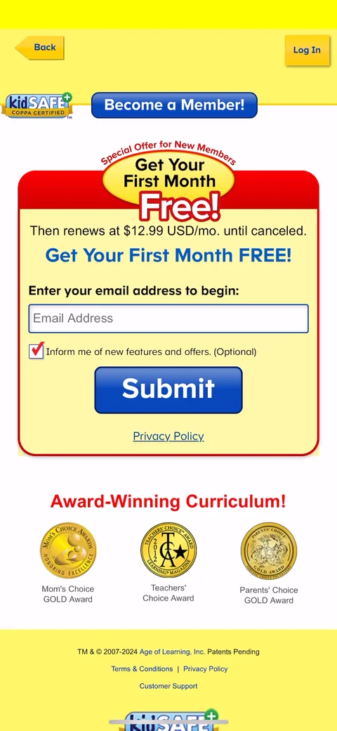 6
6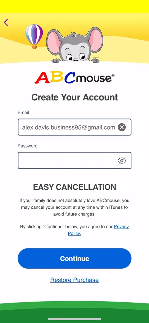 10
10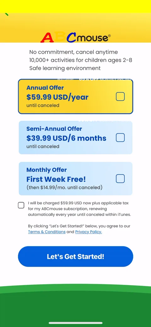 13
13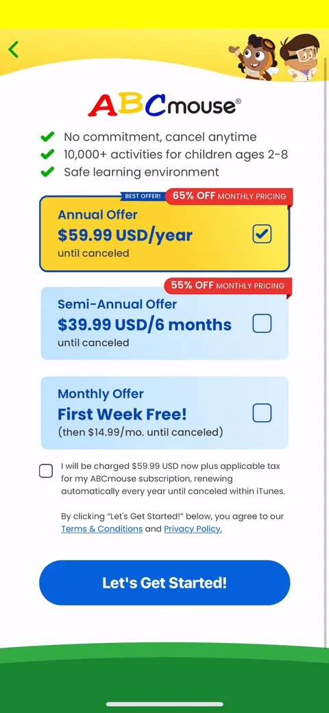 14
14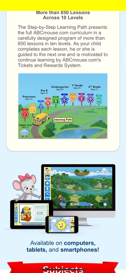 17
17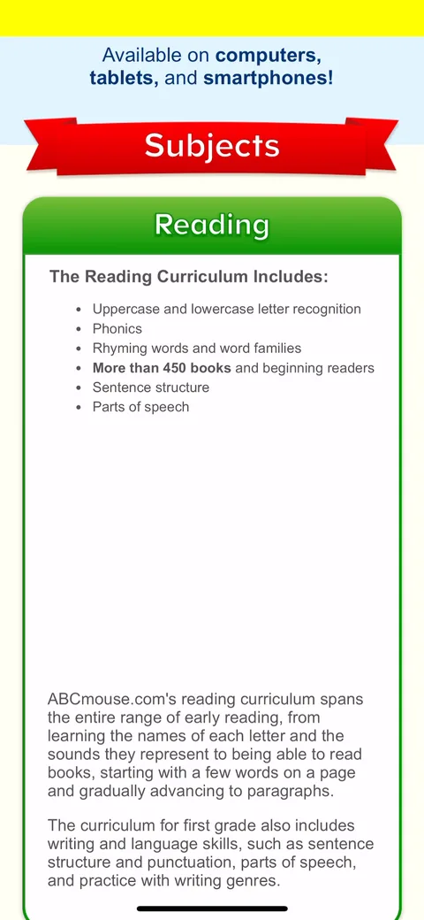 18
18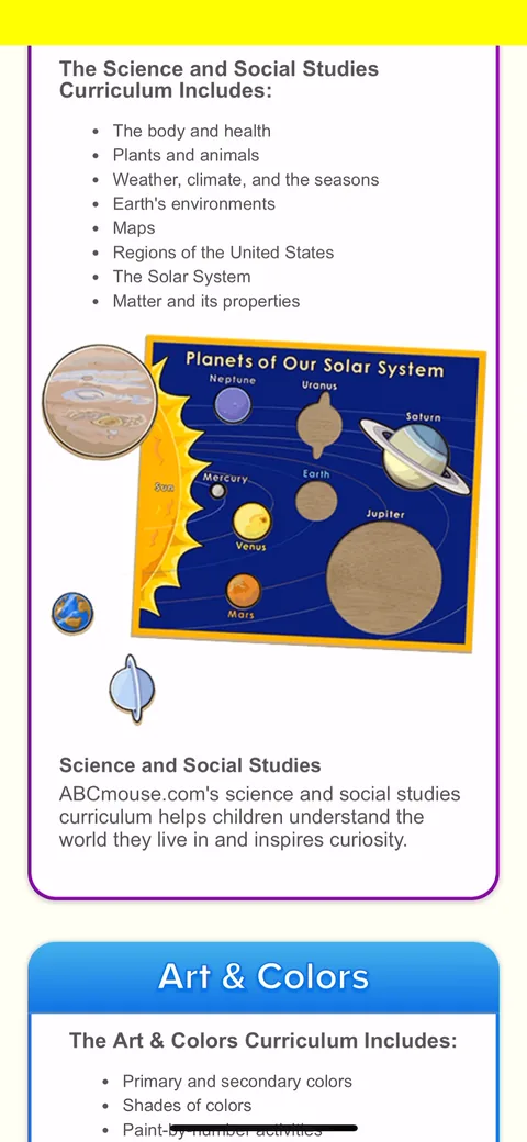 24
24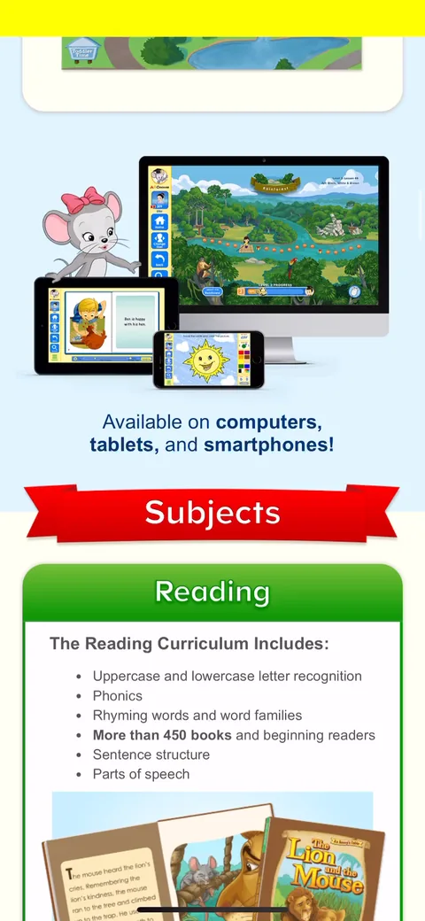 25
25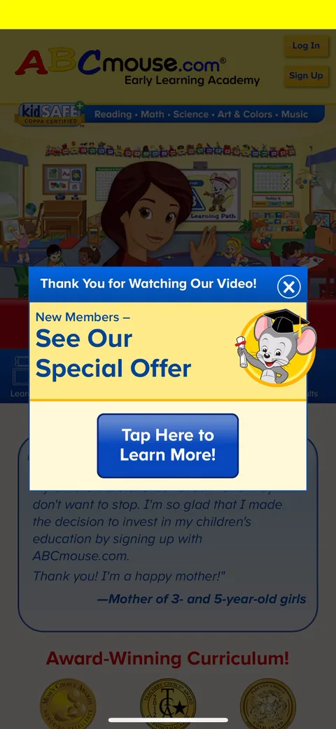 29
29